Showing posts with label art history. Show all posts

Thursday, August 7, 2025

THREADS OF EMPIRE: A History of the World in Twelve Carpets, fascinating light on history


THREADS OF EMPIRE: A History of the World in Twelve Carpets
DOROTHY ARMSTRONG

St. Martin's Press (non-affiliate Bookshop.org link)
$33.00 hardcover, $16.99 ebook, available now

A LIBRARY JOURNAL BEST BOOK OF 2025

Rating: 4* of five

The Publisher Says: Carpet specialist Dorothy Armstrong tells the stories surrounding twelve of the world’s most fascinating carpets.

Dorothy Armstrong’s Threads of Empire is a spellbinding look at the history of the world through the stories of twelve carpets. Beautiful, sensuous, and enigmatic, great carpets follow power. Emperors, shahs, sultans and samurai crave them as symbols of earthly domination. Shamans and priests desire them to evoke the spiritual realm. The world’s 1% hunger after them as displays of extreme status. And yet these seductive objects are made by poor and illiterate weavers, using the most basic materials and crafts; hedgerow plants for dyes, fibers from domestic animals, and the millennia-old skills of interweaving warps, wefts and knots.

In Threads of Empire, Armstrong tells the histories of some of the world’s most fascinating carpets, exploring how these textiles came into being then were transformed as they moved across geography and time in the slipstream of the great. She shows why the world’s powerful were drawn to them, but also asks what was happening in the weavers’ lives, and how they were affected by events in the world outside their tent, village or workshop. In its wide-ranging examination of these dazzling objects, from the 5th century BCE contents of the tombs of Scythian chieftains, to the carpets under the boots of Stalin, Roosevelt and Churchill at the 1945 Yalta Peace Conference, Threads of Empire uncovers a new, hitherto hidden past right beneath our feet.

I RECEIVED A DRC FROM THE PUBLISHER VIA NETGALLEY. THANK YOU.

My Review
: My only complaint is this DRC had none of the images the finished book has; I waited to write this review until I saw a finished book, so I could judge for myself how well the author's careful descriptions of these art objects evoked my perception of them.

Very well indeed, as it happens.

Best aspect of the read was the charming-to-me blend of personal anecdote and intensive research. They're blended in a way that evokes the sensation of having a personal chat with that world-renowned subject matter expert who's our personal bestie that we all have. (Or wish we did anyway.)

Flying on her magic carpet of knowledge across huge spans of time and space, Author Armstrong shows us how human creativity and skill are "rewarded" by exploitation and subjugation all too often. The existence of imperialism is not new. It is always, however, driven by greed. The subject of greed shifts over time but it never leaves us.

As the chapters are devoted to specific carpets from different cultures and eras, coveted by imperialists, a chronological organization would not work very well. It's sort of loosely there if you squint just right. I recommend reading the book as presented, however, not trying to do something more "orderly" with its vast erudition on a subject I'd bet not many of us know much about. It might help to space the chapters out, more like stories in a collection. I did that more or less by accident.

It should surprise no one that the majority of the anonymous creators of these artworks were women, and all were from disadvantaged, relatively powerless groups. A recurring theme, this, in Western colonial attitudes.

Feminists, art-history buffs, anti-imperialist readers, and the serious trivia hounds are encouraged to pick one up. Casual lovers of pretty books, well, if carpets are you thing yes; we're not looking at a coffee-table book, though.

Well worth springing for the paper book. I think the ebook must have some of the illustrative images but how they come across will be heavily device dependent. Stick to the half-millennium-old printing technology.

Saturday, December 7, 2024

THE AMERICAN ART-UNION: Utopia and Skepticism in the Antebellum Era, beautiful art history-filled object for #Booksgiving


THE AMERICAN ART-UNION: Utopia and Skepticism in the Antebellum Era
KIMBERLY A. ORCUTT

Empire State Editions (non-affiliate Amazon link)
$39.95 hardcover, available now

Rating: 4.5* of five

The Publisher Says: The first comprehensive treatment in seventy years of the American Art-Union's remarkable rise and fall

For over a decade, the New York-based American Art-Union shaped art creation, display, and patronage nationwide. Boasting as many as 19,000 members from almost every state, its meteoric rise and its sudden and spectacular collapse still raise a crucial Why did such a successful and influential institution fail? The American Art-Union reveals a sprawling and fascinating account of the country's first nationwide artistic phenomenon, creating a shared experience of visual culture, art news and criticism, and a direct experience with original works.

For an annual fee of five dollars, members of the American Art-Union received an engraving after a painting by a notable U.S. artist and the annual publication Transactions (1839–49) and later the monthly Bulletin (1848–53). Most importantly, members' names were entered in a drawing for hundreds of original paintings and sculptures by most of the era's best-known artists. Those artworks were displayed in its immensely popular Free Gallery. Unfortunately, the experiment was short-lived. Opposition grew, and a cascade of events led to an 1852 court case that proved to be the Art-Union's downfall. Illuminating the workings of the American art market, this study fills a gaping lacuna in the history of nineteenth-century U.S. art. Dr. Kimberly A. Orcutt draws from the American Art-Union's records as well as in-depth contextual research to track the organization's decisive impact that set the direction of the country's paintings, sculpture, and engravings for well over a decade.

​​Forged in cultural crosscurrents of utopianism and skepticism, the American Art-Union's demise can be traced to its nature as an attempt to create and control the complex system that the early nineteenth-century art world represented. This study breaks the organization's activities into their major components to offer a structural rather than chronological narrative that follows mounting tensions to their inevitable end. The institution was undone not by dramatic outward events or the character of its leadership but by the character of its utopianist plan.

I RECEIVED A DRC FROM THE PUBLISHER VIA EDELWEISS+. THANK YOU.

My Review
: I've mentioned before my upbringing was very heavy on the art-world access, and a lot of art history came into my knowledge base as part of that. I was drawn to this book in part because it dealt with a topic I'd heard about, but had never gotten too much information regarding, so...well, curiosity got the better of me.

Thomas Hicks, Calculating, 1844. Oil on canvas, 13 5/8 x 17 in. (34.61 x 43.18 cm). Museum of Fine Arts, Boston, Gift of Maxim Karolik for the M. and M. Karolik Collection of American Paintings, 62.273. Photograph © 2024 Museum of Fine Arts, Boston.


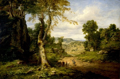
George Inness, View in Berkshire County, Massachusetts, Clearing off After a September Storm, 1849. Oil on canvas, 48 x 72 1/4 in. (121.92 x 183.52 cm). Buffalo Bill Center of the West, Cody, Wyoming; Whitney Western Art Museum; Gift in Memory of L.G. Phelps and Frances Phelps Belden, 21.00.

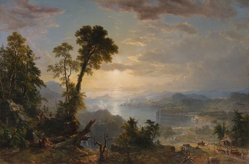
Asher B. Durand, Progress (The Advance of Civilization), 1853. Oil on canvas, 48 × 72 in. (121.92 × 182.88 cm). Virginia Museum of Fine Arts, Richmond. Gift of an anonymous donor, 2018.547. Photo: Travis Fullerton © Virginia Museum of Fine Arts.

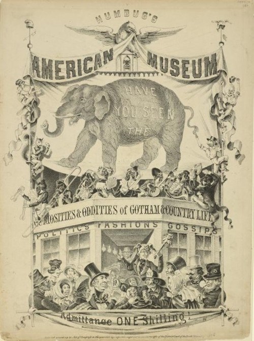
Nagel and Weingärtner, Humbug’s American Museum, 1851. The Miriam and Ira D. Wallach Division of Art, Prints and Photographs: Print Collection, The New York Public Library.

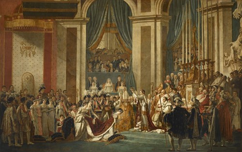
Jacques Louis David, Coronation of Emperor Napoleon and Josephine at Notre-Dame in Paris, December 2, 1804, 1808–22. Oil on canvas, 240 1/8 x 382 1/4 in. (610 x 971 cm). Chateaux de Versailles et de Trianon. © RMN-Grand Palais / Art Resource, NY

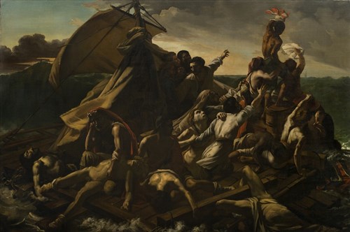
George Cooke, Raft of the Medusa, ca. 1830. Oil on linen, 51 3/8 × 77 1/4 in. (130.5 × 196.2 cm). New-York Historical Society, Bequest of Uriah Phillips Levy, 1862.4. Photography © New-York Historical Society.

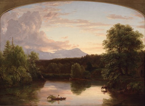
Thomas Cole, North Mountain and Catskill Creek (Sunset on the Catskill), 1838. Oil on canvas, 26 7/16 × 36 7/16 in. (67.2 × 92.6 cm). Yale University Art Gallery, Gift of Anne Osborn Prentice, 1981.56.

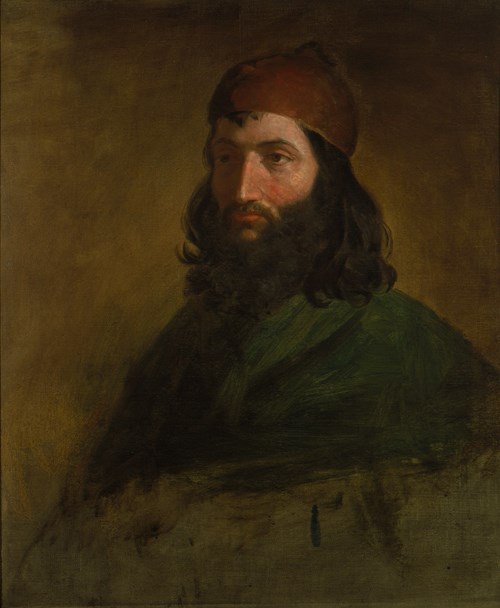
Washington Allston, Sketch of a Polish Jew, 1817. Oil on canvas, 30 1/4 × 25 1/4 in. (76.8 × 64.1 cm). National Gallery of Art, Corcoran Collection (Museum Purchase, William A. Clark Fund).

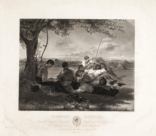
Alfred Jones after William Sidney Mount, Farmers Nooning, 1843. Engraving. National Museum of American History, Smithsonian Institution.

☀☀☀☀☀☀☀☀☀☀☀☀☀☀☀☀☀☀☀☀☀☀☀☀☀☀☀☀☀☀☀☀☀☀☀☀☀☀
I've selected these images from the ones made available for reviewers to draw from in their reviews. (There are eighty-seven illustrative images in the entire text.) I think these choices offer the gifter of the book, to self or others, a pretty solid overview of the aesthetic on display in the book. If you like nineteenth-century art, more or less academic in its emphasis, this book is a great choice to ornament your coffee table.

The idea of the American Art-Union, its aim to bring visual culture to the entire borning nation, resonated with me like I was a bell and it was a clapper. Its aims, its choices, and the idea of a drawing to win original art...well, take my money, y'all.

Sadly the times were just not in sync with this lofty aim. The inevitable problems with Authority, among the membership, and all the usual nonsense that attends doing something large and ambitious that exceeds the practical and the cultural infrastructure, concatenated in a spectacular flame-out.

Unusually, the author chose to follow the internal threads of the story. I felt a bit at sea for a while, as I'd expected the bog-standard chronological structure. No indeed...and to be honest, it serves the story being told better than a chronolgy would have done. I can see that this technique will make enemies, though, so I don't want you to go in to a $40 book only to be blindsided with a synthetic approach where one expects an analytical one.

I'm eager for fellow appreciators of nineteenth-century utopianism, of the urgent need to create a visual culture in this world of philistines, and those who just flat love to look at art, to get one of these beauties for themselves, or a like-minded friend.

The Table of Contents, with its relative page counts, will show you better than I can what the author does with this story. The amount of text dedicated to the events chronicled is proportional to the importance of the events themselves, much more directly than I find is usual in art-history works:
Introduction: The Dream of Art for the People | 1

1 Engravings: To Lead Taste or to Follow? | 29

2 Selecting Artworks for Distribution: From Democracy to Oligarchy | 63

3 The Free Gallery: Art, Anxiety, and Revolution | 99

4 Distributions and Membership: “Messengers and Missionaries of Art”? | 122

5 The Bulletin: From Education to Provocation | 155

6 Slowly, Then All at Once: The Demise of the American Art-Union | 180

Acknowledgments | 209

Appendix A: American Art-Union Resources | 211

Appendix B: American Art-Union Officers and Committee of Management, 1839–51 | 213

Appendix C: American Art-Union Engravings Distributed to All Members | 216

Notes | 219

Sources Cited | 253

Index | 271
This is a fine work of scholarly thought, meeting beautiful art images, and coming together to produce a book that your budding historian, your culture vulture, and your very artsy giftee will eat up with a terribly refined runcible spoon.

I did.

Friday, December 6, 2024

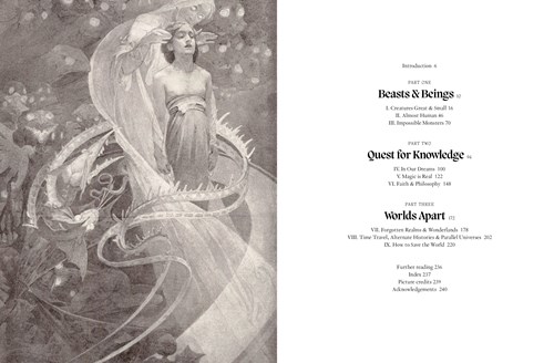
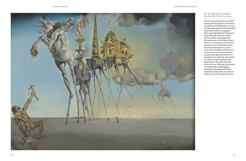
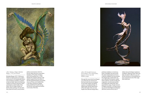
THE ART OF FANTASY: A Visual Sourcebook of All That is Unreal, gorgeous gift book for the fantasy and/or art-loving teen...and up!


THE ART OF FANTASY: A Visual Sourcebook of All That is Unreal
S. ELIZABETH

Frances Lincoln Ltd
$30.00 hardcover, available now

Rating: 5* of five

The Publisher Says: The Art of Fantasy is an inspiring curation of art for fans of myth, magic and the unreal – from gallery greats (the Surrealists and Symbolists) to artists working in the margins today.

This beautiful, fully illustrated book presents a compendium of artworks throughout history which have been inspired by myth, fantasy and the unreal.

Artists have explored imaginary worlds and fantastical creatures for centuries, expressing the unreal and impossible, the mystical and mythical, via the medium of paint.

But what draws them to the imaginary, the uncharted and the unknown? Is it merely an escape from reality? Or are they seeking a greater understanding of the human experience, or perhaps the very meaning of life itself? With myriad styles and methods of expression, what links artists through the ages? And how have these visual flights of fancy and imagination changed over the course of time?

The Art of Fantasy is a visual sourcebook of all that is fantastical – from fine art to illustration, and from surrealists and symbolists to the creatives working in undefined territories. While the artists in our history books (Blake, Goya, Dali, Magritte, Ernst) first brought fantasy art to the galleries, it was the twentieth century artists who brought it to the masses. It is in this book that, for the first time, they are united and equally weighted, presenting a mesmerising and thoughtful curation of the best fantasy artwork out there.

This is an inspiring collection for fans of myth, magic, fantasy and art history.

I RECEIVED A DRC FROM THE PUBLISHER VIA EDELWEISS+. THANK YOU.

My Review
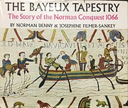
: I grew up around art, and artists. The first Christmas gift I remember the moment of getting is one I'd seen in the bookstore (they were mostly in department stores in those days, this one was in Saks Fifth Avenue), loved and wanted very badly: The Bayeux tapestry: the story of the Norman Conquest, 1066 by Norman Denny.

I was, as this shows, an odd kid. My favorite kids' books were Dr. Seuss's deeply surreal weirdnesses. My father and I absolutely loved reading those together. Our house was decorated with original art, and my mother's bestie for almost my entire life was an artist whose work still adorns my walls.

In short, I'm exactly the buyer, if only tangentially the reader/viewer, this book has in its crosshairs. I knew the artists and most of the artworks in here. I got the point of it immediately on reading the first few paragraphs. It's a very good introductory compendium for the oddball world of surreal and fantasy art and artists. I'm also inclined to give this book as a gift to someone of, say, thirteen or so on up, who loves fantasy books, who draws a lot, and/or who is just discovering the immensity of our visual culture.

The best thing about this beautiful object as a gift is it elucidates the visual and intellectual culture of "fantasy" as a creative worldview without going all art-history blather. It's a book that reads like the good conversation one can have with an older loved one on a subject dear to their own heart.

As a gift, I think it is about perfect. As a self-gift, it *is* perfect, worth your treasure in trade for its beauty and wisdom.

Friday, August 27, 2021

THE BOOK OF ERRORS will delight and enlighten some, bewilder and befuddle others


THE BOOK OF ERRORS
ANNIE COGGAN (art) and MARK HAGE (text)

A Public Space Books
$18.00 trade paper, available now

Rating: 4* of five

The Publisher Says: A collection of three illustrated essays looking at the preservation of three historic houses—and the layered, messy process of reconstructing our past and reimagining history. An architect and artist, Annie Coggan delves into the history of three iconic American structures—the Henry Knox Memorial in Maine; Fraunces Tavern in New York City; and the Betsy Ross House in Philadelphia—and the stories of the people and ideas involved in their preservation to consider the ways in which history is reshaped by future generations.

I RECEIVED A DRC FROM THE PUBLISHER VIA EDELWEISS+. THANK YOU.

My Review
: A literary magazine of some significance gave birth to a publishing company of some significance. I've reviewed So Much for That Winter, one of their earlier book publications of a translation from the Danish via Graywolf Press, on this blog. I've also reviewed their initial own-imprint publishing venture, the late and underknown Bette Howland's delight of a short-fiction collection, Calm Sea and Prosperous Voyage, on this blog. As both of those were positive reviews, I think you could safely say I am in tune with this press's aesthetic.


Here you see the artwork that forms the spine of this book's conceit. It is a series of beautiful paper models, and drawings, and painted drawings, of three different historic homes that are going to be conserved, restored, or rebuilt. The specific examples I've used are those provided by the publisher; all are from the Henry Knox Memorial, a house named "Montpelier," in Thomaston, Maine. The facts about the house are: It is a nineteen-room recreation, finished in 1929, of the original space built in 1794; that space was demolished in 1871 to make way for the Thomaston Railroad. The essay about this house is in the form of letters to and from the architect of the reconstruction, William E. Putnam, to one of the commissioning parties, Miss Watts of the Daughters of the American Revolution. Are these "real," by which I mean were they written by the parties whose names are on them, and selected by Author Coggan; or are they fabrications of Author Coggan's, made to elucidate a point about the eternal and delicate process of reaching a working understanding between client and architect?

I don't think it matters.
I don't see how anything but the effect, the gentle and eloquent interplay of images such as the above, with the words such as:
The evidence, even of eyewitnesses, as to the probable plans of the Knox House are so at variance that we have to consider it carefully and test each bit by things that we are sure of from a practical standpoint...

I wish you would read carefully Miss Miller's description and check it up with your remembrance. Also, if she is still living, I should think that a talk between you and her might clear up many of the points about which a difference of opinion seems to exist....

really makes a difference to the way one experiences this beautiful and thoroughly satisfying melding of idea, image, and purpose. We are brought into a quotidian conversation between patron and architect, between a man and a woman both of senior years, and thus in conjunction with the beautiful art, we are flies on the walls of these moments when History, long dead even then, was being negotiated for presentation to The Future. It is always a worthwhile endeavor to learn about what goes into the making of the world thee and me see.

Author Coggan's beautiful paper-and-paint constructions offer something I think too many books about preservation, architectural history, and art in general lack: A what-if, a road-not-taken approach to visual arts that I resonated with. It could simply be that I am so enchanted by the art itself that I am happy to see it used in this unusual manner. I grant that others might not feel this is anything other than a very niche project, showing a blow-by-blow of things that didn't happen, or might have happened, instead of cold non-fiction.

I see value in the exploration this approach allows of the why, the deeper why, of art and architecture pressed onto the service of History and the Monomyth of American History. The exceptionally contentious "restoration" of Fraunces Tavern, more precisely called a "conjectural reconstruction" (thanks, Wikipedia!), is illustrated in black-and-white drawings which, quite lovely though they are, suit the more angry and contentious responses to the Sons of the Revolution's major, and not uncontroversial, reimagining of the Tavern as of the 1790s (from the distance of 1904!):
"On passing the Washington statue...I thought I heard a loud sobbing... I said, 'Why weepest thou?' He said, 'Hast been to Fraunces's Tavern lately and witnessed the scoundrelly piece of vandalism that they have perpetrated upon that hallowed building, with whose walls I embraced my loved comrades?'"
—Letter to the New York Times (1906)

Daniel Libeskind, he of the master-planned Freedom Tower complex on the site of the old World Trade Center Twin Towers, would've recognized the entire imbroglio as being New York City doing what she does best: Eating her young. Nothing can ever be accomplished in the City without a decade of brangling, infighting, and public bitching.

The last of the three historic structures whose futures were assured by these early preservation attempts was famed upholsterer and flag-designer, Betsy Ross, whose residence in Philadelphia came in for a "re-configuration" to make it more suitable a setting for the probably apocryphal transfer of a flag designed by Mrs. Ross in her role as a famed upholsterer in Philadelphia society to General Washington. Since the probability is that Mrs. Ross didn't ever live in that tourist mecca, there's really no point getting exercised about it...and Author Coggan uses beautifully simple line drawings to evoke the scale of the house (it's dinky!) and the simplicity of its furnishings (spartan).

I think this lovely object belongs on the coffee tables of those whose appreciation for art is not limited to visual expressions of design, but also reaches for the "why" of art...what about this is necessary, what in this artistic expression am I going to think about and become acquainted with that I haven't, wouldn't, or couldn't otherwise?

This book is meant to close those gaps for you, elegantly, about parts of History that more often than not are so dead to us that we couldn't care less if they were there at all. I salute your vision, A Public Space Books, and your talent, Author Coggan!

Monday, February 12, 2018

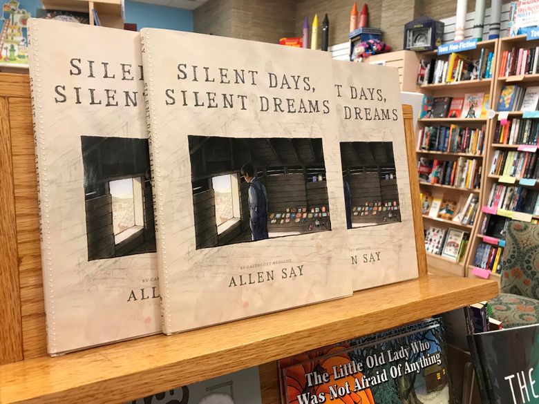
SILENT DAYS, SILENT DREAMS is a kids' book in name only


SILENT DAYS, SILENT DREAMS
ALLEN SAY

Arthur A. Levine Books
$21.99 hardcover, available now

Rating: 5* of five

UPDATE! AWARD NEWS! The 2018 American Library Association Awards honored Author Say's work with its Schneider Family Book Award for books that embody an artistic expression of the disability experience! Well-earned, well done, and congratulations.

The Publisher Says: James Castle was born two months premature on September 25, 1899, on a farm in Garden Valley, Idaho. He was deaf, mute, autistic and probably dyslexic. He didn't walk until he was four; he would never learn to speak, write, read or use sign language.

Yet, today Castle's artwork hangs in major museums throughout the world. The Philadelphia Museum of Art opened "James Castle: A Retrospective" in 2008. The 2013 Venice Biennale included eleven works by Castle in the feature exhibition "The Encyclopedic Palace." And his reputation continues to grow.

Caldecott Medal winner Allen Say, author of the acclaimed memoir Drawing from Memory, takes readers through an imagined look at Castle's childhood, allows them to experience his emergence as an artist despite the overwhelming difficulties he faced, and ultimately reveals the triumphs that he would go on to achieve.

My Review: I will never be able to thank my friend Joe enough for bringing this book, this artist, this art, into my life. I am so profoundly grateful to you, old friend.


James Castle with the tools of his trade. I don't know the date, but he died at 78 in 1977, so I'll venture a guess at early 1960s...? I'm actually surprised, given how very little the people he lived among seem to have liked him, that someone took his photo at all.

Artist and Caldecott Medalist Allen Say created this artwork at the request of an Idaho-based friend of his. It was his introduction to James Castle...he says of this amazing moment, "I opened the catalog and suddenly remembered the excitement of seeing a van Gogh for the first time." I rang like a bell when I read that. I had just had the same experience opening this book and seeing Say's artworks based on Castle's.

A spread from this gorgeous book.

I've got a reasonably sophisticated knowledge of art. I'm up to speed on "outsider art" and its importance in our visual vocabulary, to our aesthetic landscape. But there hasn't been an experience quite like discovering, via Artist Say, the astonishing work of James Castle in a very, very long time. The sheer breadth of the material he left behind is astounding! Sculptural constructions, drawings in their thousands, mobiles, it's like the man was working against a deadline that only he knew about and was determined to finish saying what he had no other way to say.

The publisher, Arthur A. Levine Books (the imprint responsible for bringing Harry Potter to the US market), is bringing this to us via a damned-near perfect design and production job. The aesthetics of the design you can see for yourself above. If you don't think that it's outstandingly lovely, look at it in person. If you still don't agree, okay, but why? What failing do you adduce to this presentation of two-color artwork mixed with four-color artwork and all presented in a beautiful matte-coated glowingly white space? What artistic flaw do you find with Artist Say's beautiful, spare evocations of the grim and terrible world of James Castle?

And it was a grim and terrible world, a kind of hell that I fear with all my wobbly, trembling emotional heart isn't unique except in its reasonably happy ending. Artist Say has gone as deep as one can into the little factual material of this ordinary life. His bibliography is quite substantial...and disturbingly complete...for someone who, absent Fate's intervention, would simply have vanished without a trace from the collective memory of US society. I knew I could trust Artist Say to tell me the truth about James Castle when I read:
To emulate his unschooled style, I used the same kinds of odd materials he had used: soot and spit, liquid laundry bluing, and shoe polish, to name a few.
I had help. My wife meticulously made dolls and birds out of wastepaper and cardboard that I think the artist would have approved. I drew on ninety-year-old letters and envelopes that {his friend} found in an antique shop; and to mimic James's unsteady lines, I often switched lands—to my left hand, which hadn't learned to tell lies.
Artist Say is the right one to lead us into James Castle's work, and his life and times insofar as any of us can know them.

The Seattle Times gives us the jacket of this glorious book in its native environment, the store where you'll be going to spend USD 21.99 (higher in Canada) to bring it home with you. And now you're able to do it legally, since a Federal judge ruled that Artist Say didn't violate Castle's estate's copyrights in offering us, in 28 cases from the 150 drawings in this book, his own artistic impression of specific Castle pieces.

Isn't that a sad statement of our current society's obsession with ownership? A beautiful illustrated biography would quite probably have pleased Castle, whose early relationship with books (despite being unable to read or write) was a loving and profound one. Not at issue were any facts, any alleged misrepresentations of Castle, his family, anything...just ownership of the images and therefore the right to profit from them.

Had I been related to Castle I'd've cringed in shame for the picture painted of a cold, uncaring, even cruel "family" that frankly seems to me to be culpably negligent and abusive of their child/sibling/educational charge. They sound like horrible people and I'm glad they're dead.

Tuesday, March 28, 2017

AGNES MARTIN, overlooked for pop-fame but not for artistic recognition of her genius


AGNES MARTIN: Her Life and Art
NANCY PRINCENTHAL

Thames and Hudson
$39.95 hardcover, available now

Rating: 5* of five

The Publisher Says: Over the course of a career that spanned fifty years, Agnes Martin s austere, serene work anticipated and helped to define Minimalism, even as she battled psychological crises and carved out a solitary existence in the American Southwest. Martin identified with the Abstract Expressionists but her commitment to linear geometry caused her to be associated in turn with Minimalist, feminist, and even outsider artists. She moved through some of the liveliest art communities of her time while maintaining a legendary reserve. I paint with my back to the world, she says both at the beginning and at the conclusion of a documentary filmed when she was in her late eighties. When she died at ninety-two, in Taos, New Mexico, it is said she had not read a newspaper in half a century. No substantial critical monograph exists on this acclaimed artist the recipient of two career retrospectives as well as the National Medal of the Arts who was championed by critics as diverse in their approaches as Lucy Lippard, Lawrence Alloway, and Rosalind Krauss. Furthermore, no attempt has been made to describe her extraordinary life. The whole engrossing story, told here for the first time, Agnes Martin is essential reading for anyone interested in abstract art or the history of women artists in America."

THIS SPECTACULARLY LOVELY BOOK WAS PROVIDED BY THAMES AND HUDSON AT MY REQUEST. I AM DEEPLY GRATEFUL TO YOU.

My Review: Agnes Martin's life began in complexity, proceeded in complexity, and ended in complexity. She wasn't from a happy family, evidence suggesting her father's existence added little to her mother's happiness or material success; his life appears to have diverged from his family's before Agnes could possibly have known anything of him, as early as 1914 (she was born in 1912) when her mother assumed ownership of the Saskatchewan land where he brought them to homestead. The famously close-mouthed Martin spent most of her youth on Canada's West Coast, not the Saskatchewan prairie; yet it was that prairie, vast and limitless vistas defined by the unique quality of unmodulated light, that ever and always lived in her eye.

Author Princenthal's unenviable task in biographizing Martin was set early on, in that closed-mouthedness and its close relative "is this real or is it Memorex?" Can the few recorded utterances of a quiet, and often quietly under the heavy burden of mental illness...symptoms recorded by friends suggest schizophrenia dogged Martin's life, undiagnosed and gratefully not severe enough to cause outside intervention...be rationalized into a single narrative, or is it even important and relevant to make this attempt?

I myownself say no to that. I think what survives in the way of others' memories of Martin and her life and her utterances are best read, viewed, absorbed as simply as possible, representative of Martin's preferred presentation of self. Let us leave the private and inner world of the artists to the artist, accept what she said at a given moment as her truth, and recognize that her truth evolved with her spirit and her magnificent, mathematical, ultimately and beautifully spiritual artwork.
Martin's retrospective evaluation of the artwork she made during her initial years in New Mexico was categorical: "At Taos I wasn't satisfied with my paintings and at the end of every year I'd have a big fire and burn them all." ... The ouevre begins modestly, with several small watercolor landscapes strongly reminiscent of John Marin; they could be among those of which she said, "I used to paint mountains here in New Mexico and I thought my mountains looked like anthills." This is not necessarily a failure of representation. The clarity of the atmosphere in New Mexico (see above for reference to unmodulated light) does make distant mountains look deceptively close, hence oddly small, and Martin's depictions are sprightly and fresh, capturing the regal blue sky and hurrying clouds so characteristic of the high desert.
This 1947 image of Taos' mountainous amazing landscape is a rare survivor of Martin's tendency to destroy her works, a female Cronus (Crone-a? heh), when they weren't up to her demanding standards. Princenthal on this specific piece:
...a confident sketch of deeply shadowed mountains in bright sunlight, rendered with quick, precise strokes.
This is precisely how the image hits my eyes and the words could have come from my own brain; this is the moment when I began to trust Author Princenthal to lead me, not simply to inform me of facts, but lead my eyes to moments and places I would have gone to had I the erudition and the visual vocabulary to know of them. In reading a book about an artist, this sense is (for me) irreplaceable; it is akin to the feeling I get when, as a recent and deep disappointment with Edward Hoagland's latest novel demonstrated on the downside, an editor and/or author demonstrates a solid and deep grasp of detail.

Martin's early and unsatisfactory landscapes, journeyman works no doubt but fine ones indeed, gave way in her middle age...she was forty in 1952...to the Abstract Expressionist-ish work of her second round of schooling at Teachers College of Columbia University in New York. The heady art atmosphere of 1950s New York could not possibly have passed Martin by, though Author Princenthal makes plain the comparatively more conservative art culture of the college. I suppose that's inevitable in an academic setting where preparing a person for a career in art instruction is the purpose. This image is, in my eyes, one of the most Agnes Martin-ly images she produced in that time, superior in its emotional affect on me to several more derivative Abstract Expressionist canvases:
Martin spent much of her life...well into her 50s...either in poverty or damned close to it. Not so very unusual for an artist, I suppose, but I can't help but feel when I look at this huge 48" x 72" work that the cost to her for the materials must have been ruinous; and to my eye, the painting itself should have sold for Jackson Pollock money. Princenthal has this to say about the work:
More robustly narrative, Expulsion of Adam and Eve from the Garden of Eden, tentatively dated 1953, is, at 4 by 6 feet, a very large painting by Martin's standards at the time.... It is executed in oil on board, and in feeling is decidedly graphic, with delicate contours, executed in finely drawn, ink-black lines, and vaporous washes of color. The biblical narrative is given a sharp twist into what clearly seems, not the exodus of two mortals fallen from a state of grace, but the escape of a terrified woman from a powerful if irresolute man. Adam's head, outlined in profile, faces up, howling; a star shoots across the sky above him. Though reaching forward, he seems immobilized, perhaps by the horseshoe-like shapes that link his slightly bent knees. His upright form spans the surface, an anchoring column. Eve, by contrast, is in chaotic flight. Facing us, her arms wide in appeal, she is lifted up by a graceful, bounding leg, and also by a spinning, propeller-shaped foot; she appears as well to be supported by wings. Windswept green leaves adorn her back. The colors, thinly applied, are mostly pale shades of pink, blue, and white, though a bright red form scythes across Adam's midsection; flying toward his chest is what seems to be a disembodied breast. For all the inscrutability of its symbolism, the composition is powerfully integrated; its emotional register is of baffled panic, as in a dream from which the sleeper desperately tries, without success, to scream herself awake.

This 1958 work is unusual and deeply interesting to me. Martin's creation of it is structural as well as painterly. It fits my idea of Martin as an artist of space and time. The author has this insight to offer:
Without question she would come to resist, in the most vigorous terms, any suggestion that her work represented landscape, water, weather, light, or any other natural conditions or forms. But the natural allusions in titles persist for some time...what is arguably clearest, in these works of the late 1950s and early '60s, is the difficulty of giving up such references to landscape and water, of turning away from the kind of natural beauty to which she was so clearly alive, and which offered so much in the way of painterly, and emotional, resources. ...Martin was experimenting with reliefs and fully three-dimensional constructions made from materials found around the [New York] seaport. The Laws, 1958...consists of a tall, narrow wooden board (it is 93-1/2 by 18 by 2 inches) that is painted grey below and black on top; a gridded pattern of boat spikes is driven into the black field. ... "The life of the work depends upon the observer," [Martin] wrote. And, "if we can know our response, see in ourselves what we have received from a work, that is the way to the understanding of truth and all beauty."
So for all Martin's strenuous rejection of Nature as Muse, Martin the artist knew and said in words that the viewer perceives the work and derives from it the meaning and beauty that she can, and will. So while the intent was not to re-create the world on canvas or board, the perception of the viewer inarguably takes precedence over the intent of the artist. Constructions like The Laws can be seen as attempts to reject Nature but end up, at least to this viewer, evoking the very seaside that provided their materials. I don't think Martin was done with the natural world.

Martin's many years in New Mexico were a wildly mixed bag, monetarily speaking; her art never stopped its endless refining process. Sometimes it's only in deprivation that a spiritual seeker can find a way to speak her truth. Martin's explicit rejection of Nature as her muse will always ring hollow to me. She herself said, "Almost everyone believes that art is from the of the artist meaning the intellectually grasped experience. ... I want to repeat: there are no valid thoughts about art. If your sensibilities are awake you will respond."
This 1992 untitled image presents the Agnes Martin I suspect most people are familiar with. Her color planes and smooth geometry and gorgeously realized symmetry create a calm mood, a lot like looking at a Taos springtime landscape or a visit to a sunrise seashore. Agnes Martin's limitless vistas and perfectly tuned spaces, colors, shapes, and ideas are timeless...literally outside of time. Her art, in that sense, truly does reject nature as a muse. It's impossible to paint a landscape or a still life that is outside of time. Light forbids it.

Agnes Martin's endless journey into the symmetry and beauty of shape, form, geometry, and color's softest subtlest corners, really constitute a biography told in awakened images. The work absolutely perfectly reflects this summation by Author Princenthal:
The way Martin lived, the way she dressed and ate, socialized ans spent her private time, the way she furnished her homes and traveled, conformed to no one's notions of high style. She didn't wear black, she wasn't svelte or soignée. While she never owned a television (or a computer), neither did she live off the grid...She loved fancy cars and ocean liners. She liked being honored. She valued humility above all else. She was at once a consummate insider and a lifelong outsider, a devoted student of Zen and Christian mysticism, ans a sworn skeptic. She was of sound mind (and to the extent that such a state can be defined), and at times she was not. Her most reliable testimony remains her majestic work.


NOTICE All Agnes Martin artworks are copyrighted. For information on reproduction rights, contact Agnes Martin/Artists Rights Society, New York.

Wednesday, March 8, 2017

JOAN MITCHELL: LADY PAINTER, though painter she was lady she most assuredly was not

JOAN MITCHELL: LADY PAINTER
PATRICIA ALBERS

Alfred A. Knopf
$21.99 Kindle edition, available now

Rating: 4* of five

The Publisher Says: “Gee, Joan, if only you were French and male and dead.” —New York art dealer to Joan Mitchell, the 1950s

She was a steel heiress from the Midwest—Chicago and Lake Forest (her grandfather built Chicago’s bridges and worked for Andrew Carnegie). She was a daughter of the American Revolution—Anglo-Saxon, Republican, Episcopalian.

She was tough, disciplined, courageous, dazzling, and went up against the masculine art world at its most entrenched, made her way in it, and disproved their notion that women couldn’t paint.

Joan Mitchell is the first full-scale biography of the abstract expressionist painter who came of age in the 1950s, ’60s, and ’70s; a portrait of an outrageous artist and her struggling artist world, painters making their way in the second part of America’s twentieth century.

As a young girl she was a champion figure skater, and though she lacked balance and coordination, accomplished one athletic triumph after another, until giving up competitive skating to become a painter.

Mitchell saw people and things in color; color and emotion were the same to her. She said, “I use the past to make my pic[tures] and I want all of it and even you and me in candlelight on the train and every ‘lover’ I’ve ever had—every friend—nothing closed out. It’s all part of me and I want to confront it and sleep with it—the dreams—and paint it.”

Her work had an unerring sense of formal rectitude, daring, and discipline, as well as delicacy, grace, and awkwardness.

Mitchell exuded a young, smoky, tough glamour and was thought of as “sexy as hell.”

Albers writes about how Mitchell married her girlhood pal, Barnet Rosset, Jr.—scion of a financier who was head of Chicago’s Metropolitan Trust and partner of Jimmy Roosevelt. Rosset went on to buy Grove Press in 1951, at Mitchell’s urging, and to publish Henry Miller, Samuel Beckett, Jean Genet, Jack Kerouac, Allen Ginsberg, et al., making Grove into the great avant-garde publishing house of its time.

Mitchell’s life was messy and reckless: in New York and East Hampton carousing with de Kooning, Frank O’Hara, James Schuyler, Jane Freilicher, Franz Kline, Helen Frankenthaler, and others; going to clambakes, cocktail parties, softball games—and living an entirely different existence in Paris and VĂ©theuil.

Mitchell’s inner life embraced a world beyond her own craft, especially literature . . . her compositions were informed by imagined landscapes or feelings about places.

In Joan Mitchell, Patricia Albers brilliantly reconstructs the painter’s large and impassioned life: her growing prominence as an artist; her marriage and affairs; her friendships with poets and painters; her extraordinary work.

Joan Mitchell re-creates the times, the people, and her worlds from the 1920s through the 1990s and brings it all spectacularly to life.

My Review: This is a life, not a biography, in the sense that it offers more of a rounded picture of Joan Mitchell than a rigorous analysis of her milieu and her position and her place in history. Mitchell, a hard-drinking, hard-loving, hard broad, is famous if you know who she is, and invisible if you don't. I suspect that would make her really, really mad. Mitchell was a daughter of privilege, wealthy dermatologist father and novelist/poet/editor (Marion Sobel Mitchell) mother, who felt unloved and grew into a figure-skating champ, then an early Abstract Expressionist/Action painter, then the wife of serial monogamist/avant garde publisher Barney Rosset (an old friend of ours), whose life-work running Grove Press was all due to Joan telling him about her friend's failing little publishing company, and finally ending her days as an expatriated eminence grise of feminist art in America. How she hated that! The expatriating part she loved, living in a small French village where Monet had honed his Impressionist chops; the feminist part? Loathed it from the depths of her gin-soaked soul. She felt no kinship with Woman. She felt no unmixed feeling, frankly, on any subject. She was a difficult, dangerous friend and a worse enemy. She was deeply disagreeable, arguing to no great purpose about anything with anyone, and seldom offering any kind of apology for the havoc she caused in the lives and worlds of those around her.

She died of cancer at sixty-seven, after drinking, smoking, and boinking enough for three dozen misspent youths. Barney was sincerely distraught. I suspect he never got over her. He talked about her quite a lot...the other four wives, not so much, unless there was some child or grandchild related reason to do so. I don't imagine anyone else had an unmixed response.

Her work was...it remains...well...go here to see Field for Skyes, which she painted to release the grief of losing her beloved Skye terrier Bertie. It's an IMMENSE piece of art, but even in the inkydinky Internet form, it's lovely. In person, Mitchell paintings are all about paint...the effects of different techniques of putting paint onto a painting are crucially important to the visual experience of the painting. In photos, that's simply not possible to reproduce. But enough survives to give you a chance to experience Mitchell's passion. Like it or don't, and I don't much, Mitchell's work is strong and intense and accomplished. What it isn't, and what I suspect she knew it wasn't, is great.


Field for Skyes, Hirshhorn Museum of the Smithsonian Institution

Books about art are, unless they're big and all in color and lushly produced, like safe sex: enough of the real thing survives that you're inclined to continue, but it ain't like the real damn thing, and no amount of skill or wishing or forcing yourself to believe is gonna make it so.

Patricia Albers does a decent job conveying the chaos and the bleakness of Mitchell's life. She does a lot less well at giving any hint as to why the woman didn't kill herself in existential crisis...does ANYthing make Mitchell happy? I couldn't say...but the inevitable moment when Albers must speak to us, her readers, about paintings she cannot show us in a 400+-page mostly text book, points up this book's major failing. Here, from p249, is Albers describing Mitchell's painting Ladybug, painted per Albers very shortly after the death of Mitchell's beloved singer Billie Holiday in 1959:
"Luscious garden hues -- cadmium red, celadon, cobalt blue, ultramarine, slurry brown, carmine, ochre, acid raspberry -- splash and streak through this luminous nine-foot-wide oil. Some colors optically blend. Others pop from the picture plane, thanks in part to the painter's astute use of red-green and blue-ochre polarities. (The latter, along with Ladybug's architectural exactitude and play of colors against aerating whites, evoke the late work of Cezanne.) Mitchell's gloriously variegated brushstrokes push and tug and shimmer and float, like the edges of planes jostling in a shallow space or foliage lifted and twirled by a breeze, kissing the light, then heaving away." (There's more, but I'm tired of typing this stuff.)

This is Ladybug, on view at the Museum of Modern Art:


I've seen the painting with my own two baby greens and, to be frank, I would not picture anything like that painting from those words. And lest it be said that everyone's experience of art is subjective, I counter that I've seen a LOT of art and even a lot of Mitchells...I, an experienced and sophisticated viewer, should be able to recognize a painting I've actually seen from this kind of description.

So...would I recommend the book to you? No, not unless you're an art aficionado possessed of a strong and broad visual vocabulary. It wouldn't hurt to read the stuff about the world of the 1950s New York School of Abstract Expressionists in here, but that's frankly not enough to make it worth your while to pick the book up. Dare if you must. But keep Google Images open and use it freely and frequently if you're braving these waters without your own mental map. Shoals abound for the innocent and the unwary.

But for the initiate, this grimoire of grimness illuminates (how ironic) some dingy corners of an important passage in American and world art. In the end, I'm glad I read it, but I suspect many would not share my interest.